
Since our design agency was spun out of a content marketing agency (Grow and Convert), we’ve had many discussions with companies on the best way to design their blog homepage. From those, we’ve noticed that most blog homepage design discussions focus mainly on aesthetics (colors, fonts, featured images, etc.), and most blog homepage layouts prioritize chronology (newest posts first).
In our experience, this focus on (1) aesthetics and (2) chronology in blog homepage design causes two major issues:
- It fails to recognize your blog as a lead generation source, which is your blog’s main purpose. Instead it treats it like a media site whose main purpose is to help readers consume more content – a wrong assumption.
- It doesn’t recognize the true user journey: users land on a blog post from Google (most often) or an external site and then explore the product or service. Instead it assumes the opposite: that users land on the homepage then go and “explore” or “peruse” the blog (very few users do this).
This thinking has multiple design and user experience implications which we’ll review below, along with five real-life examples of blogs developed with lead generation in mind.
Table of Contents
Finally, note this article is talking about designing blogs for companies that are using their blog as a marketing tool to sell some product or service, so these principles aren’t for personal blogs or blogs that are media sites (monetizing pageviews by showing ads, for example).
At Designs for Marketers, we specialize in creating blog homepage layouts that are built to drive leads. If you’re interested in assistance with your design (or redesign), get in touch for a free consultation.
Our 4 principles to blog homepage design and layouts
1. Add the product CTAs, not just email newsletter CTAs
The first blog design principle above, that your blog is a lead generation source, not a media site leads to this very simple but critical tip: you need to prioritize product (or service) calls to action (CTAs) not just email newsletter or whitepaper downloads.
But we rarely see blog homepage layouts that do this. Instead we see a lot of calls-to-action on blogs, such as:
- Sign up for our newsletter
- Download our whitepaper
- Get a free ebook
These approaches might be good for growing an email list, but that’s not the only (and in our strong opinion, not the main) purpose of your blog.
The purpose of your blog, if you’re doing content marketing correctly, is to bring in leads – for in-depth discussions on why, see this post and this post from our parent company, Grow & Convert.
So, as per our second principle, if someone lands on a blog post and chooses to learn more via the blog homepage, you need to prioritize telling them about your product or service and offering a CTA for them to start a trial, book a demo, contact you, etc.
Don’t worry about this “being too salesy”. As per the next principle below, you’ll also give them further content to read, and you can (and should) also have a newsletter CTA, but if you don’t have a product CTA (and clear benefit copy surrounding it) you’re guaranteed to miss out on some percentage of leads, which is a shame.
Also this “too salesy” worry once again misunderstands the role of a company blog. As per the Grow and Convert blog posts linked to above, it falsely assumes that content marketing is only for the top of the funnel. We disagree and we’ve shown through countless case studies on Grow and Convert that if you systematically target bottom of funnel topics and SEO keywords, the traffic you drive is ready and wiling to convert to leads or sales of your product(s) (not just email list conversions).
In the examples section below, we’ll show how our Grow and Convert client Brandfolder accomplishes this with multiple product-based CTAs on their blog homepage.
2. Prioritize your best posts, not just the most recent
Almost every blog homepage layout is based around showing the latest posts. Where does this come from? It’s certainly not a result of thinking through how to convert blog readers into customers. It’s simply an artifact of blogging’s origins (decades ago): as a “web log” of someone’s musings or thoughts on a topic.
But modern company blogs aren’t personal blogs from the age of Blogger, circa 2002. No one is reading your company’s blog like it’s their favorite newspaper, going to the homepage and hitting refresh to see what else you’ve published lately.
So, if a user decides they want to read additional posts or learn more about your company in some way, and clicks from a blog post to the blog homepage, it doesn’t really make sense to show them whatever you happened to publish recently.
Instead, you need to showcase your best posts, the ones that:
- Explain in-depth your product’s competitive advantage, benefits and uniqueness
- Are heavy-hitter producers from an SEO angle. As with this type, you want more people going to it, seeing it, and linking to it
- Are foundational articles. What does someone who’s already exposed to the brand need to know about your product?
Note how these concepts are consistent with design principle #1: focus on product CTAs and treat your blog as a lead generation source. If someone is interested enough to click to the blog homepage, they are into your company and brand, so show them your best stuff, the foundational information on why your company exists, what differentiates you, and who it’s for.
In the examples section, we’ll explain more of what makes the Grow & Convert website effective at driving traffic and leads to high-converting blog posts.
3. Include your main site header
This design principle is actually one that applies to the entire blog, not just the homepage: Since the purpose of your main site navigation is to get users to become leads you should include it on your blog’s homepage and on all blog posts. This let’s readers who land on a blog post and want to learn more or sign up for the product easily get to that information: company homepage, features page, pricing page, or even the sign up page
Including a secondary navigation of blog elements such as categories can be useful for some blogs, but it shouldn’t replace the main navigation if you want to have an effective user signup journey.
For an example of including both the main navigation and blog category navigation, see the redesign we did for Blink below.
4. Think about mobile
Finally, all of these considerations should be included when designing the mobile version of your website, which either a large fraction or often the majority of your blog readers are.
Specifically, on mobile:
- Your best post should be included above-the-fold
- Your product CTAs should remain in place
- Your important navigational elements such as pricing and signup pages should remain displayed rather than being collapsed behind a hamburger menu
See the Grow & Convert example for a better look at this.
Blog homepage layout examples
Now that you understand the basics of what makes an effective blog homepage layout, let’s take a look at 5 examples.
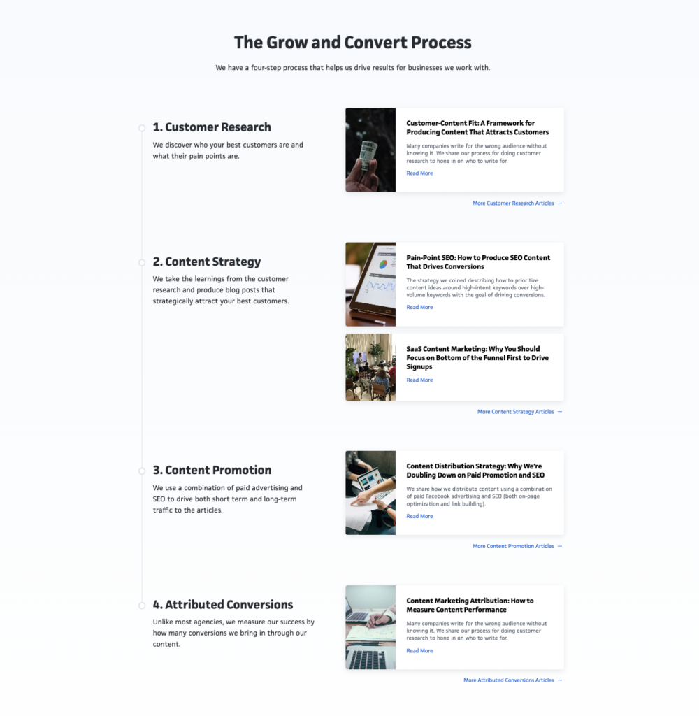
1. Grow & Convert
We’ll start by further explaining what works well on the Grow & Convert website. Since Grow & Convert is a content marketing agency, their website homepage largely serves as their blog homepage in this instance.
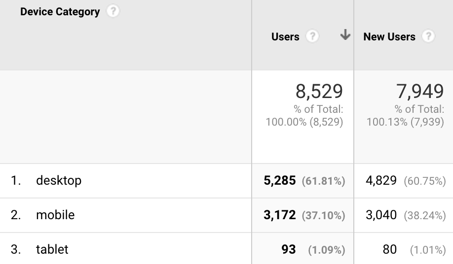
First, you notice that in the navbar at the top. There is both a link to “New Posts” and “Top Articles”. Notably, the top articles page gets 50% more traffic from people who start at another page on the site than the new posts page.
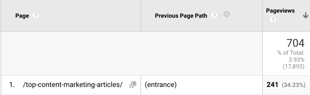
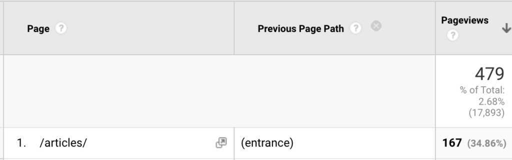
Non-entrance pageviews of the top articles page (top) are 50% higher than the new posts page (bottom).
Working our way down, the hero unit, above the fold, features both the navigation items discussed earlier, as well as the CTA “learn about our agency,” which is a foundational article that explains the basics of what G&C does and what makes it different than other content agencies.
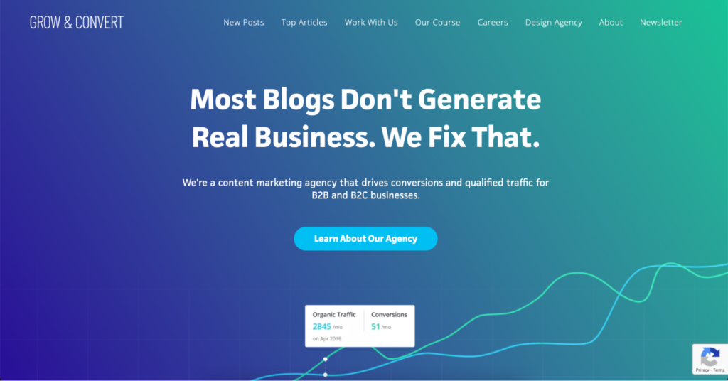
Then, when you scroll down, you’ll see a section featuring Grow & Convert’s foundational articles.
Finally, on mobile, the website continues to showcase the hero CTA as well as a service-based link outside of the hamburger menu. In this case, that link is for “articles” but on your website it may be for a sign up or pricing page.
Including the main CTA and foundational articles on this page makes the homepage effective at driving traffic to high-converting posts and pages.
Keeping these items on mobile makes sure that a large chunk (37% on the Grow & Convert website in May 2022) of traffic continues to utilize those important elements.
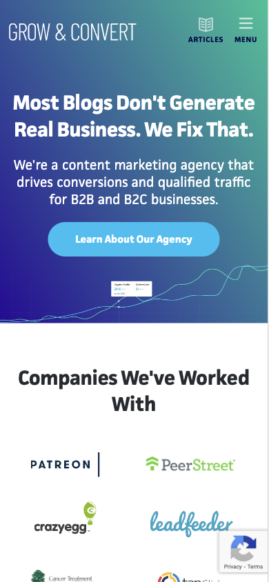
2. JustReachOut
JustReachOut is a business that helps you build and execute a sustainable long-term PR strategy to get exposure and publicity from the press. Our agency, Designs for Marketers, recently assisted in redesigning their blog homepage.
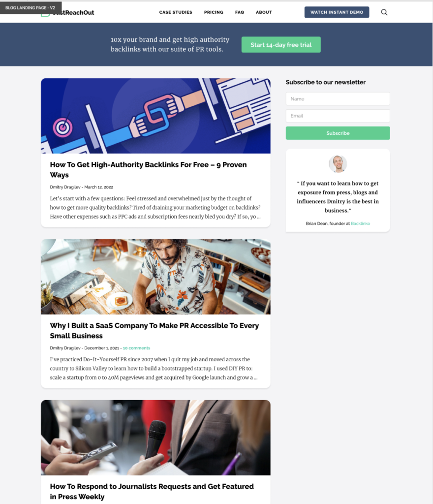
Below is the original design.
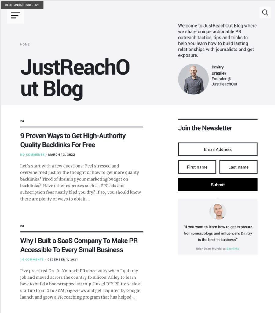
In the previous version of the blog homepage, the layout was mainly focused around the title of the blog, an about section, latest posts, and a CTA for the newsletter. You’ll notice that there are no service CTAs and all the links for the website are collapsed behind a hamburger menu.
This approach was not effective at driving leads.
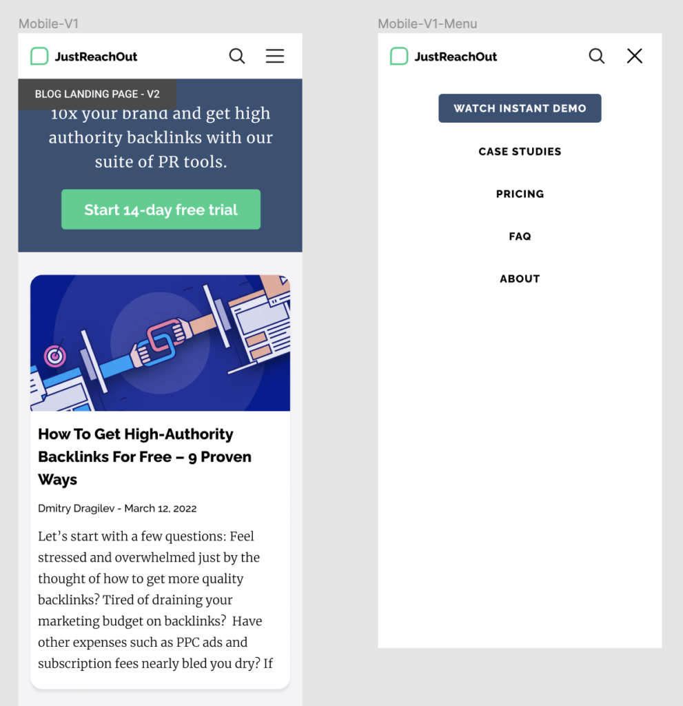
Below is the redesign that we completed.
First, you’ll notice how we put the main website navigation back into the blog homepage. This by itself adds a lot more focus to the JustReachOut product and the CTA to get started.
In addition, we replaced the large amount of real estate devoted to the founder quote with a carefully crafted sentence of the product’s benefit and a free trial link. This is redundant to some extent with the main navbar on desktop but it’s essential on mobile where the nav gets reduced to a hamburger menu (below):
In this case the blog was really young and the client felt they didn’t have really good posts produced yet so we didn’t design in a “best posts” section.
Finally, we added featured images and modernized the overall design and fonts.
3. Blink
Blink is a mobile app that connects frontline workers to everything they need in one place.
We recently redesigned their blog homepage (and rest of the blog). In the new version we included both the main site navigation with important links and a secondary navigation specific to the blog. Since there are a variety of posts for different specialties (HR, IT, etc) it was useful for the user experience to include these items.
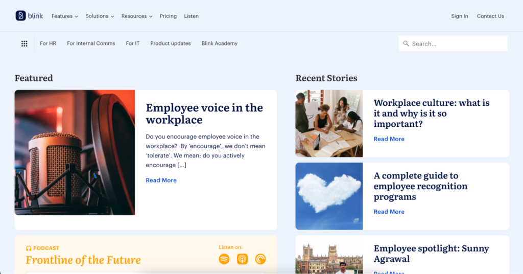
This is a simple example of how a company can have a featured story (where perhaps you keep a key foundational article that introduces people to your brand or product) and a recent stories section side by side to also keep some chronological element.
Below this, in their case, is also an opportunity to showcase their latest podcast episodes (which was already part of their blog layout before we worked with them).
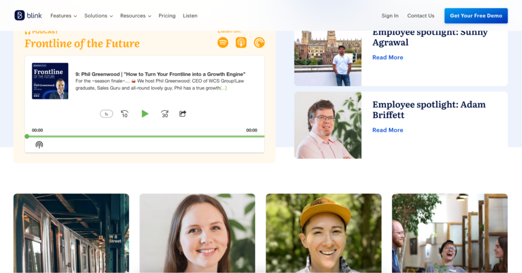
Finally, note that their main site nav remains on the blog and even includes a bold “Get Your Free Demo” button on scroll.
4. Rainforest QA
Rainforest QA is a Grow and Convert client and a no-code automation testing tool that makes it easy to write, run, and maintain software tests – no software development degree required.
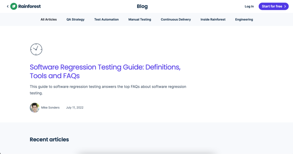
We didn’t participate in their blog homepage design but we like several elements of it. First, it has a bold, accent color CTA in the navigation making it easy for anyone to get started on their platform. The above-the-fold content also features a button back to their main site (in lieu of the main navigation) and a featured article, in this case a foundational guide on their main topic area.
In this case, Rainforest shows their most recent articles under the featured post, but if you scroll down they also have foundational articles for different categories–similar to the Grow and Convert homepage–this makes it easy for users to discover the posts that they may be interested in.

On mobile, the Rainforest blog keeps the large link back to the main website and the featured post remains above-the-fold.

You may have noticed that this blog doesn’t incorporate featured images on its homepage. That’s because featured images are not important.
Despite not using something that many other blogs highly recommend, these blogs still drive a high-quantity of leads from their articles.
What really matters is the user experience and the content of your blog.
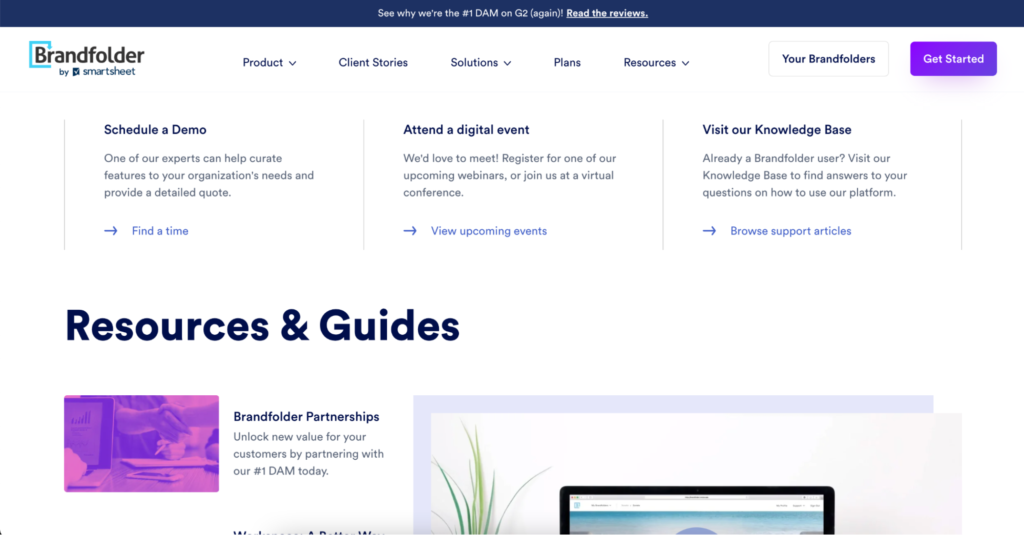
5. Brandfolder
Brandfolder, also a G&C client, is a digital asset management software company that helps marketers and creatives manage and distribute all of their assets, and understand how they’re performing.
We also didn’t design their blog homepage but love how it’s developed to drive leads in multiple ways.
First, they incorporate multiple CTAs above the fold including a get started button in the navigation, a secondary bar above the navigation, and three CTAs directly below the navigation.
Second, their main blog article is featured above the fold. When you scroll down, these articles are actually foundational pieces that explain the product and why it’s more useful than other solutions someone may be using.
In addition, the main website navigation stays in place on scroll so that the main two CTAs are visible no matter where you are on the page.
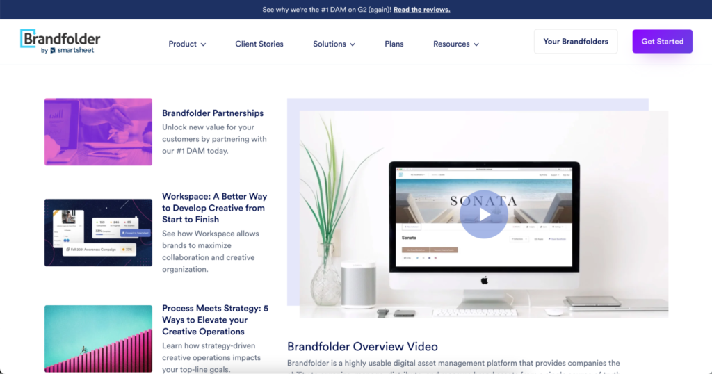
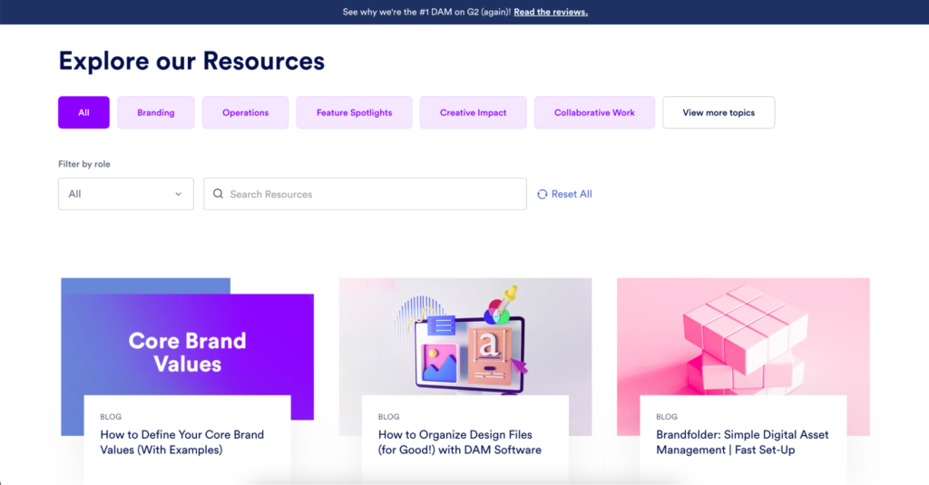
On another scroll, there is an area with a blog-specific category navigation.
On mobile, the banner CTA stays in place and the other three CTAs remain above the fold.
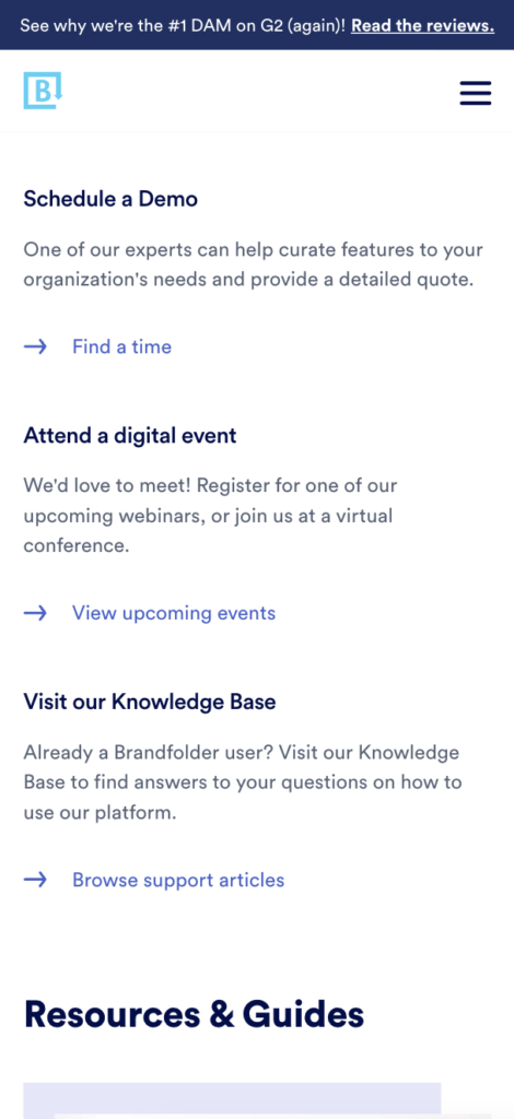
Brandfolder’s blog homepage makes use of featured images and a cohesive color palette, but those aren’t the most important elements on the page. The use of colored CTAs, and immediate foundational articles are what help this blog homepage layout to work well.
Your blog homepage’s layout should be designed to convert high-quality traffic into customers. If you need assistance from a company that knows what works and what doesn’t, reach out to us for a free consultation.